The Emotional Hook: How UX/UI Design Makes Us Fall in Love with Products
Have you wondered why EQ (Emotional Quotient) is equally important as IQ (Intelligence Quotient)? For starters, our emotional intelligence allows us to make decisions that we perceive as good or beneficial. UX/UI designers understand this well and consider this while designing websites and applications. By creating designs that evoke a personal and emotional connection, UX/UI designers ensure emotionally charged user engagement with the product they’ve designed.
What is UX/UI design?
Before we discover more about how UX/UI designers drive user engagement by tapping into their emo points, let’s first learn about what UX/UI design is and what UX/UI designers do.
UI design and UX design are often used interchangeably, but they are separate disciplines that work together.
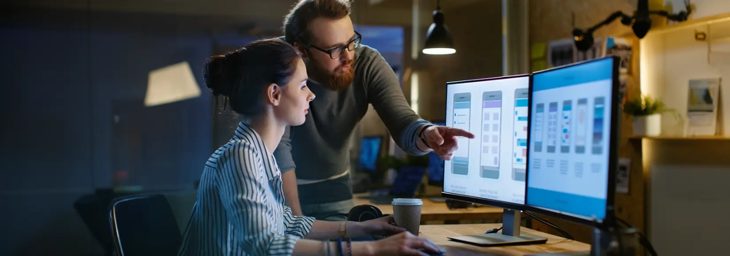
UX (User Experience) design focuses on creating a smooth user experience by designing intuitive interfaces that are easy to navigate. UI (User Interface) design focuses on the visual aesthetics and all the interactive components that users see and interact with on a digital product. The products can be applications, software, and websites.
UX designers are responsible for crafting seamless user experience journeys. This is important because a hassle-free UX design will ensure effortless task completion from the user’s end. Imagine this: a user opens their mobile banking app to pay a credit card bill. Good UX design means the app is easy to navigate, the payment options are clear, and the user can complete their payment without delay and confusion.
UI designers primarily focus on creating visually appealing and user-friendly elements for digital products. These elements include buttons, carousel sliders, graphics, drop-downs, banners, and more. UI designers ensure these components are not only aesthetically pleasing but also intuitive and encourage interaction.
How Does a Good UX/UI Design Create an Impact?
Before beginning to design, designers follow a process to ensure a successful outcome which in this case is – Users successfully completing their intended tasks by using features or elements that are actually useful, visually pleasing, understandable, and most importantly interactive.
This process begins with defining the target audience through user research. This research helps uncover user problems and pain points. Using these insights, designers create products that effectively solve these problems and address user needs.
To go beyond functionality and fulfill user needs emotionally, designers need to understand the context and intent behind a user’s need for the product. This understanding allows them to tailor designs that truly resonate with the users.
Let’s discuss some real-time examples of bad and good UX design.
Example 1:
Netflix’s autoplay preview feature can be annoying for users. It starts playing trailers automatically when browsing, disrupting the browsing experience. Many users find this somewhat intrusive and feel that Netflix is trying to influence their viewing options.

Example 2:
Google’s search landing page is minimalist and clutter-free. The clean design, fast loading time, and efficient search functionality make it a prime example of good UX. Users can quickly find what they’re looking for without distractions

Here are some examples of bad and good UI design:
Example 1:
A website like https://www.zeit.de/index (German news website) might be considered to have a bad UI design for some users. While the content is reputable, the layout can be cluttered with various sections and a busy color scheme. This can overwhelm some users who just want to find specific news articles quickly.

Example 2:
Spotify’s immersive user interface blends aesthetics with functionality. It offers both a visual treat and a seamless user experience. Unlike static interfaces, Spotify uses vibrant playlist covers to engage users.

These two scenarios help us draw one conclusion: a poorly designed website or app frustrates users, eventually driving them to competitors’ digital products. This could also ensure a surge in customer support calls as users struggle to navigate or complete tasks. One can call a specimen of design good when it accurately anticipates user needs and creates an easy and self-explanatory experience, minimizing the need for user support and saving the brand’s business resources.
H4: Flawed and Impractical Designs Kill User Engagement
A good design is about creating a positive emotional connection. Products with poor or impractical designs won’t appeal to the masses and won’t emotionally motivate them to engage more with the product or service offered through the digital platform. Additionally, the inconvenience caused due to a bad user experience can permanently cast a negative impression on the user’s mind, influencing them to refrain from giving the product a second chance.
If we like what we see and if we like what we experience, the design has done its job.
Also, a good design comes into existence when designers focus on user needs and recognize the tools and resources it takes to create a seamless experience. When users have a positive interaction with the product, a strong emotional connection is formed, and businesses achieve their goals such as increased sales and increased customer retention numbers.


